Human, not generic.
Editorial serif headlines, real places, and direct invitations. Make room for people—not just technology.

Interamerica Studios / Brand guidelines
A reference for the people shaping how Interamerica looks, feels, and speaks.
Get the brand assets01 / Essentials
Interamerica is an open builder community and a company-formation studio for the physical world. The identity connects human warmth with technical capability.
Editorial serif headlines, real places, and direct invitations. Make room for people—not just technology.
Clear hierarchy, a disciplined grid, and purposeful color. Give useful information enough room to be understood.
Use scale and contrast for emphasis. Let generous space, restrained accents, and specific language do the work.
02 / Identity
The angular symbol and widely spaced wordmark work as one signature. Use the supplied artwork; don’t recreate the lettering or substitute a font.


Give it breathing room. As a working minimum, leave half the symbol’s height clear on every side. Increase that space when the layout allows.
Available originals: transparent PNG wordmarks, 1937 × 267 px; standalone light symbol, 436 × 267 px. No SVG/vector master is included. The artwork itself uses #F7F8FF light lettering or #0C1027 dark lettering; preserve those pixels.
03 / Color
Neutrals carry the page. Ultraviolet identifies the studio; cyan signals community and invitations to participate. Click any swatch to copy its hex value.
Keep the palette selective. A section usually needs one accent, not all six. Pair color with labels, position, or an underline so meaning never depends on hue alone.
Use white on ink, ink on paper, and ink on cyan for body text and buttons. Keep small text ink/muted on light surfaces and white on ink. Ultraviolet does not meet normal-text contrast on these surfaces; reserve it for lines and larger accents. Test final combinations against WCAG contrast guidance ↗; normal text needs at least 4.5:1.
Digital values are RGB/hex. Do not infer Pantone or CMYK matches from this page.
04 / Typography
Pair an expressive serif with a clean, practical sans. Headlines create character; body copy and controls make the information easy to use.
Display / Georgia Regular
ABCDEFGHIJKLMNOPQRSTUVWXYZ
abcdefghijklmnopqrstuvwxyz · 0123456789
Georgia, serif · regular weight · sentence case
Close line spacing for headlines; natural, deliberate line breaks.
Body & interface / Inter + system sans
Use straightforward text for navigation, descriptions, forms, and detail. Put the useful information first. Let small uppercase labels establish rhythm without becoming the main event.
ABCDEFGHIJKLMNOPQRSTUVWXYZ
abcdefghijklmnopqrstuvwxyz · 0123456789
The current site specifies Inter, then system fallbacks; it does not bundle Inter. Match the stack, or explicitly install Inter from its official project ↗ for a controlled design file. Font files are not included here.
*Recommended starting ranges for new web work—not fixed dimensions for every format. Scale responsively, protect readability, and avoid leaving one short word alone on a line.
05 / Expression
Architecture, working surfaces, plants, and real rooms ground the brand. Structured layouts and precise accents bring the studio’s technical side into focus.
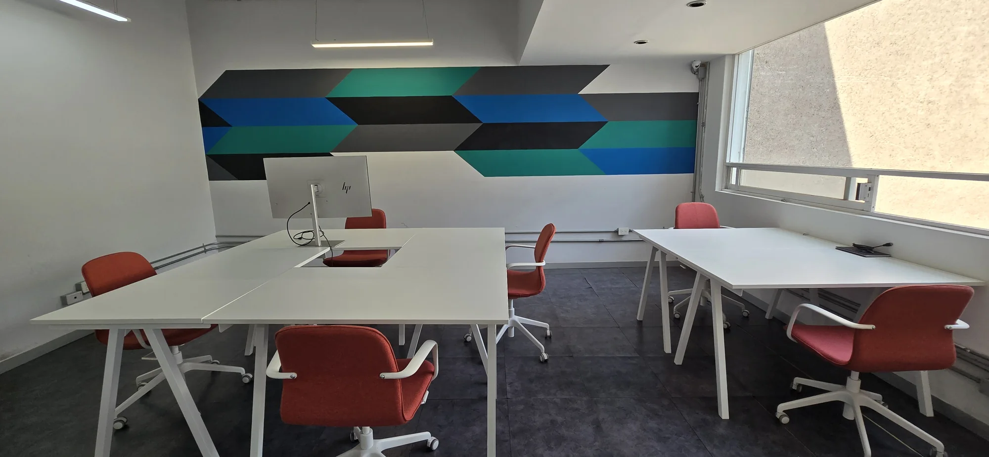
Photography / In context
Composition
Start from a clear grid. Current web content is capped at 1240 px, with generous side margins. Keep related information close and use bigger gaps between ideas.
A practical 8 px-based starting scale; existing layouts also use optical adjustments.
Shape & motion
Use straight edges, fine rules, and occasional diagonal planes. Keep illustration inside its tile. Prefer simple arrows to heavy circular containers. Use glow to signal an active link—not as a general effect.
Motion should support orientation. Respect reduced-motion preferences.
Voice
Be direct, specific, and welcoming. Favor builders, real work, and useful outcomes over abstract claims. Keep invitations short and concrete.
Use“Join the community.”
“Bring a hard problem.”
“Explore pods + ventures.”
AvoidVague innovation claims, stacked jargon, or a process label that makes the visitor work to understand the next step.
06 / Downloads
Use these assets as your source of truth. Preserve the artwork and bring these tokens into new design files, prototypes, and handoffs.
Before final production
Confirm the brief, final output size, type availability, and color reproduction. Request a vector master for large-format or fabrication work; don’t auto-trace these PNGs and treat the result as approved artwork.
This is a living working reference based on the current Interamerica Studios website. It does not replace a production proof or an approval of a new brand variant.